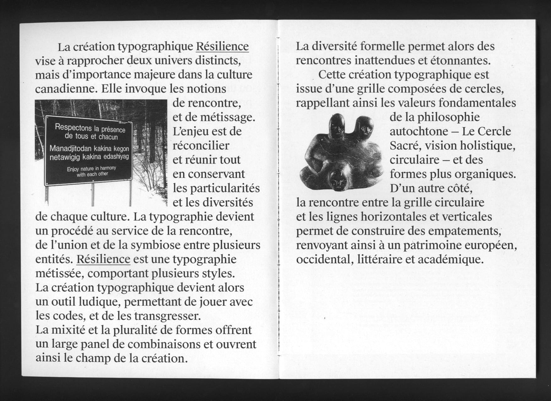
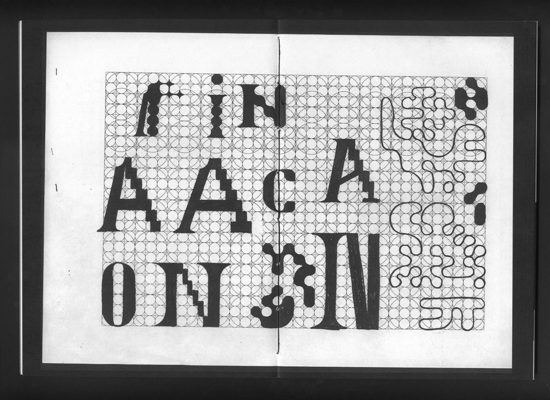
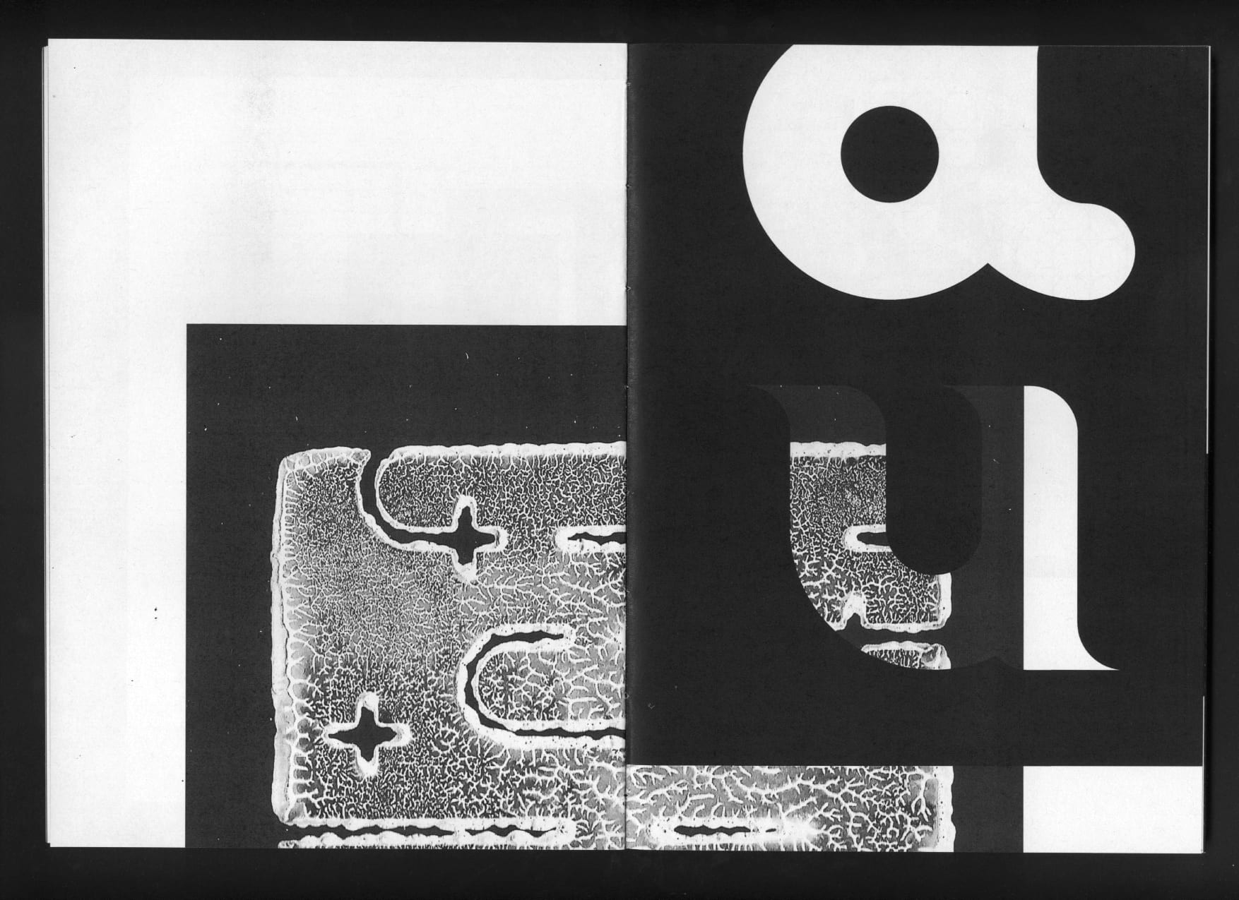
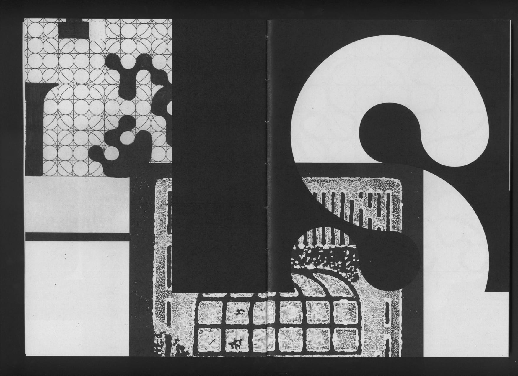
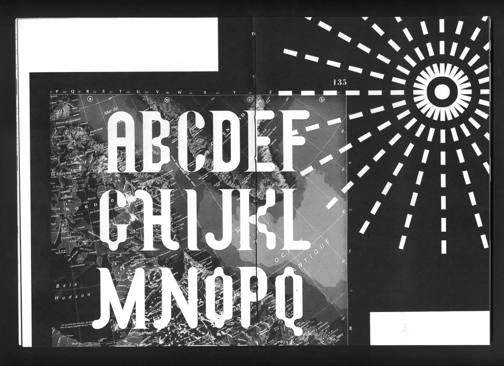
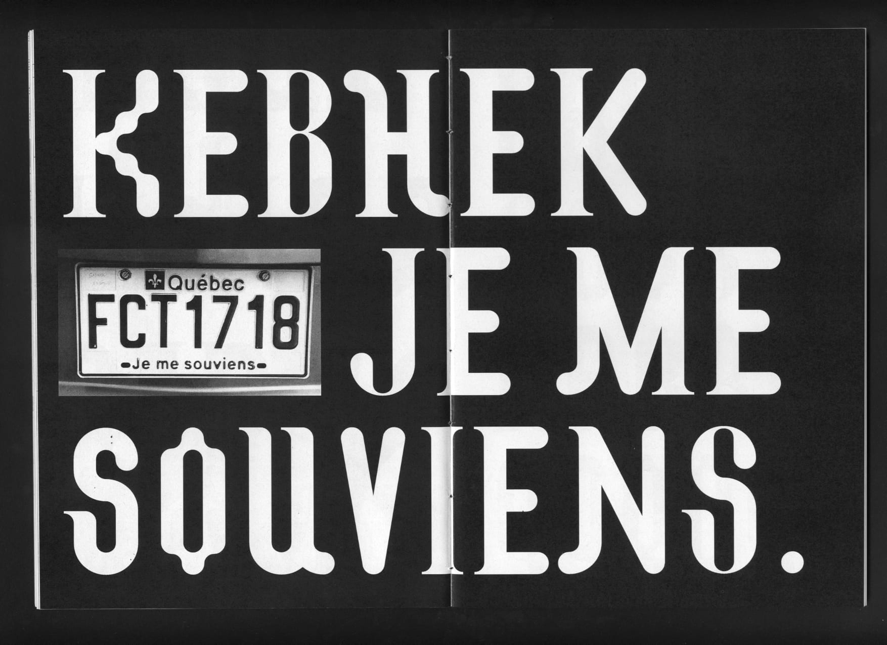
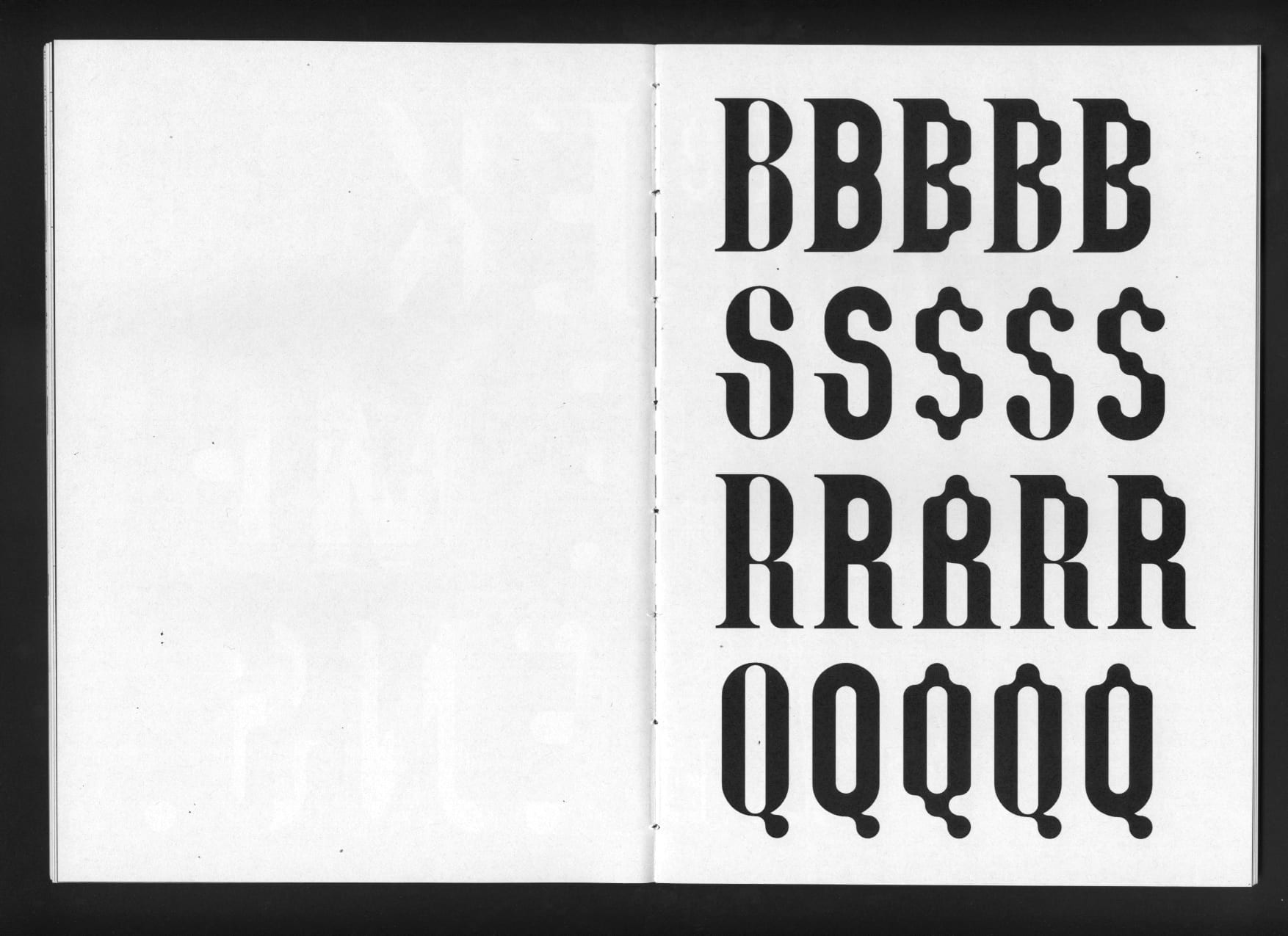
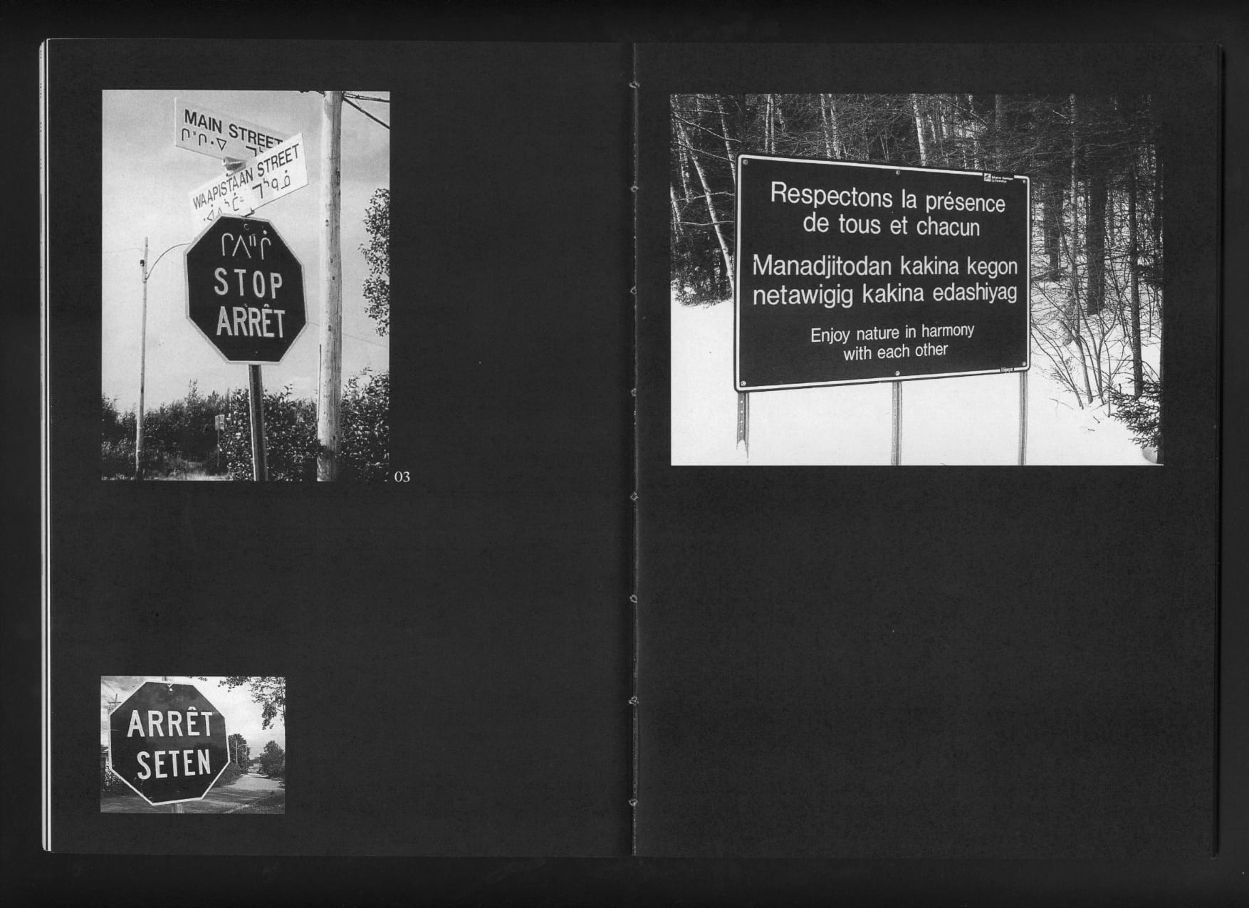
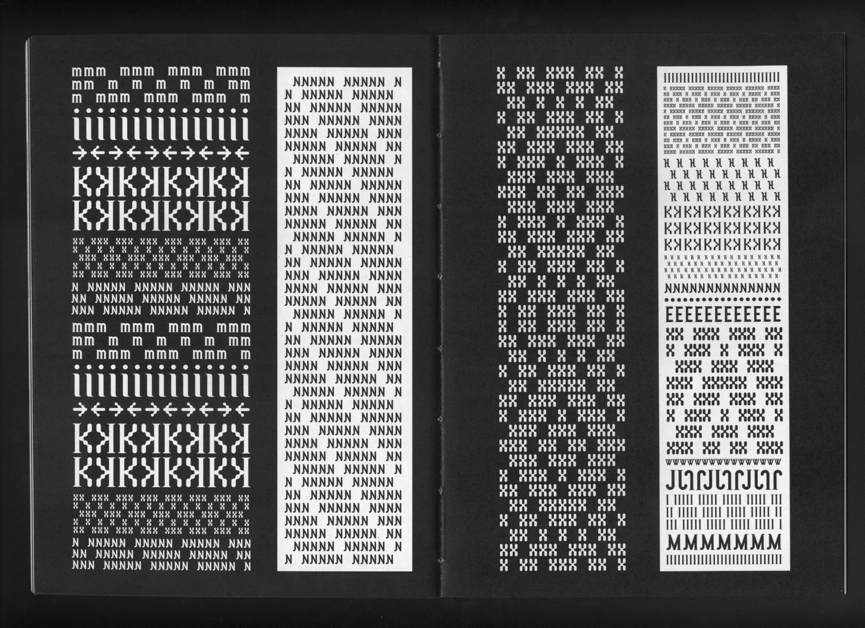
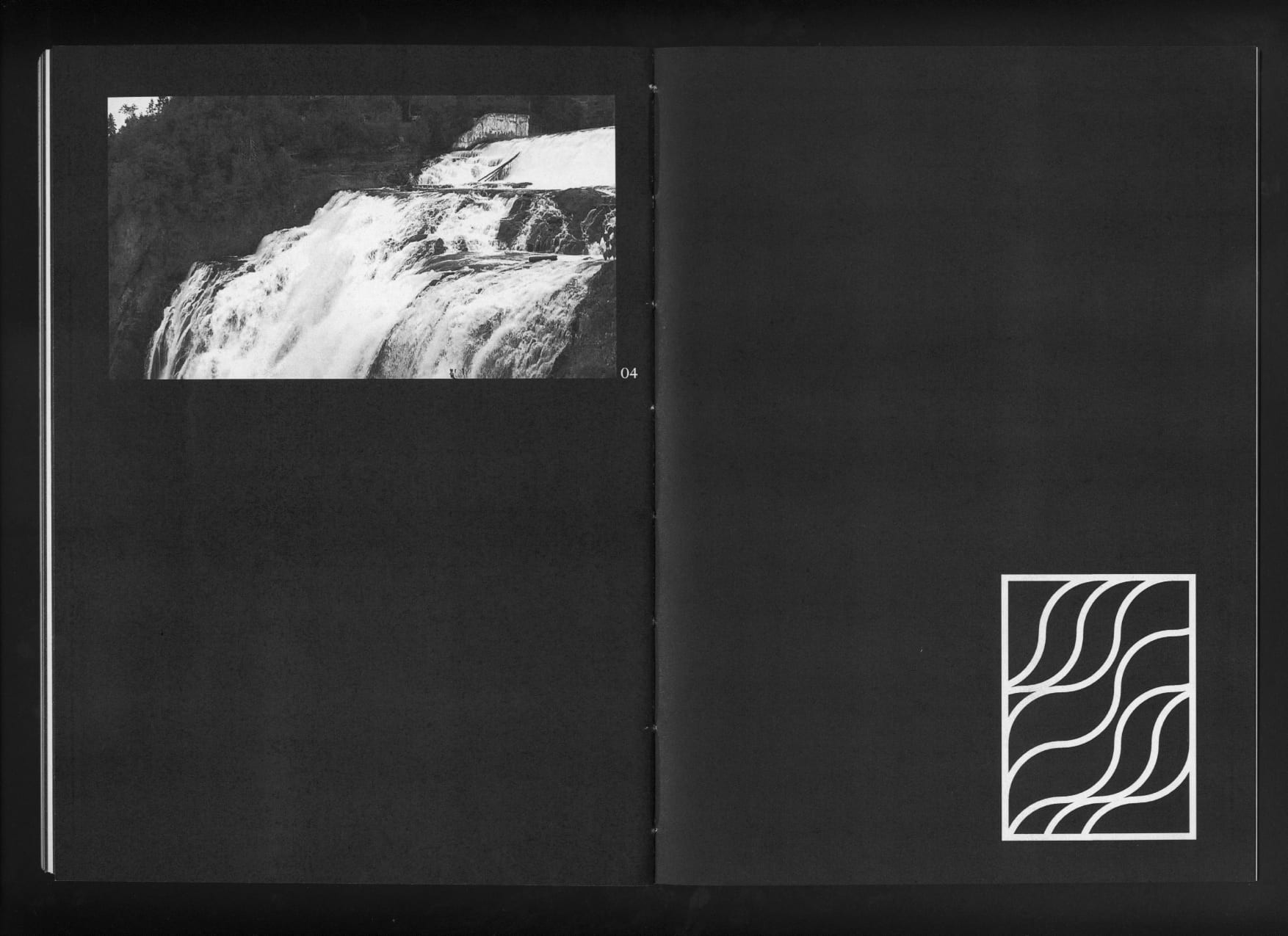
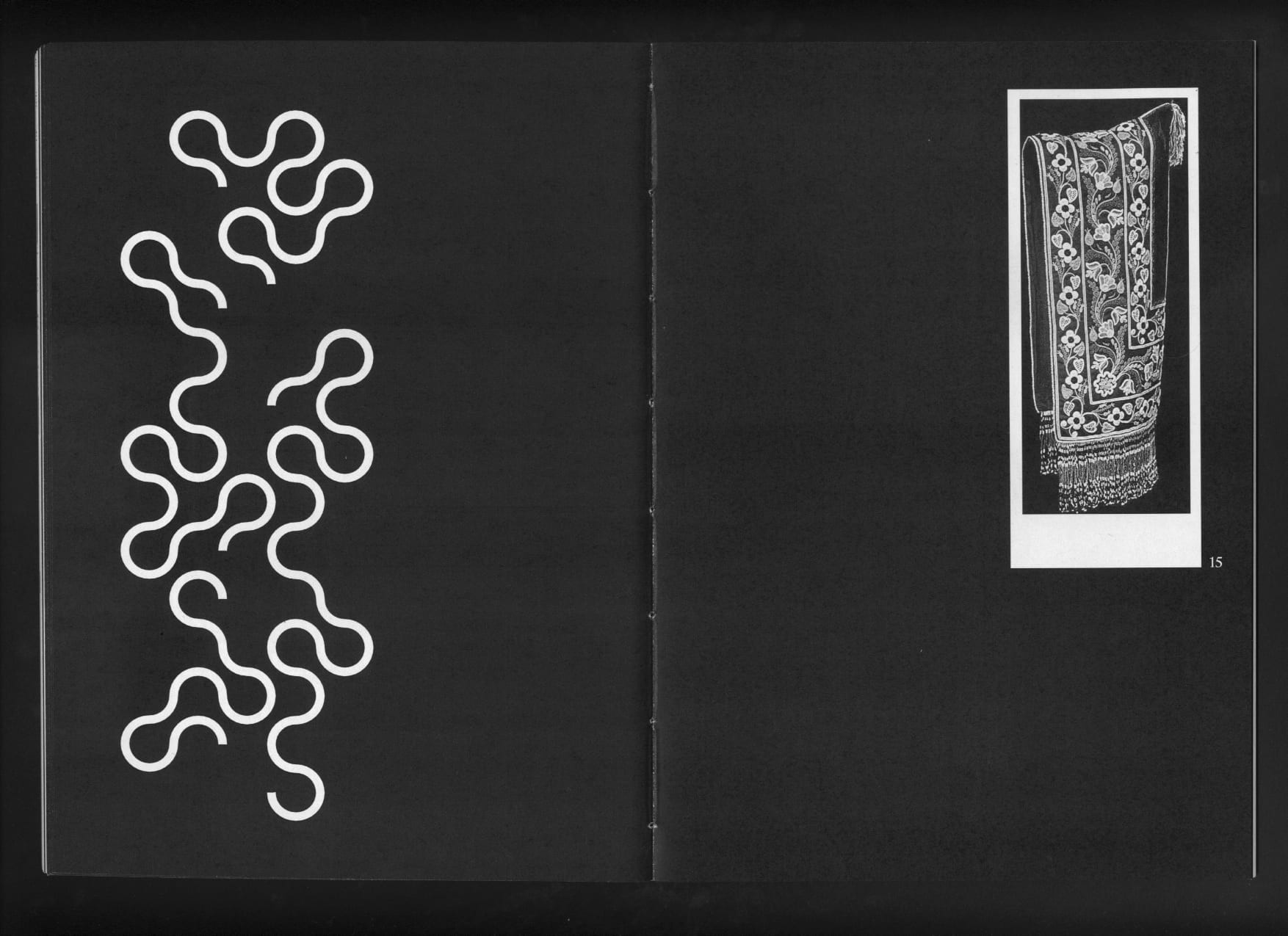
The typographic creation Résilience aims to bring together two distinct universes of major importance in Canadian culture. It invokes the notions of encounter and crossbreeding. The challenge is to reconcile and reunite while preserving the particularities and diversity of each culture. Typography becomes a process at the service of the meeting, union and symbiosis between several entities. Resilience is a mixed typography, comprising several styles. The mix and multiplicity of forms offer a wide range of combinations, allowing for unexpected and surprising encounters. It is inspired by the circular vision (at the heart of Amerindian philosophy) and European heritage (literary, serifs). At the crossroads between the organic and the academic.
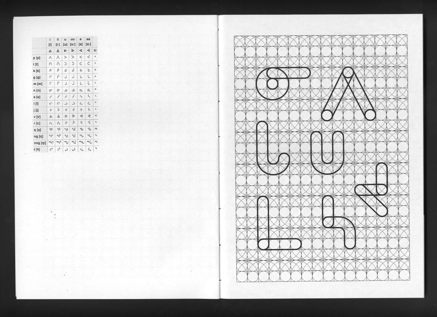
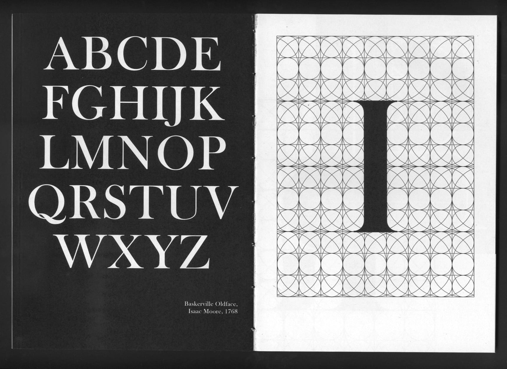
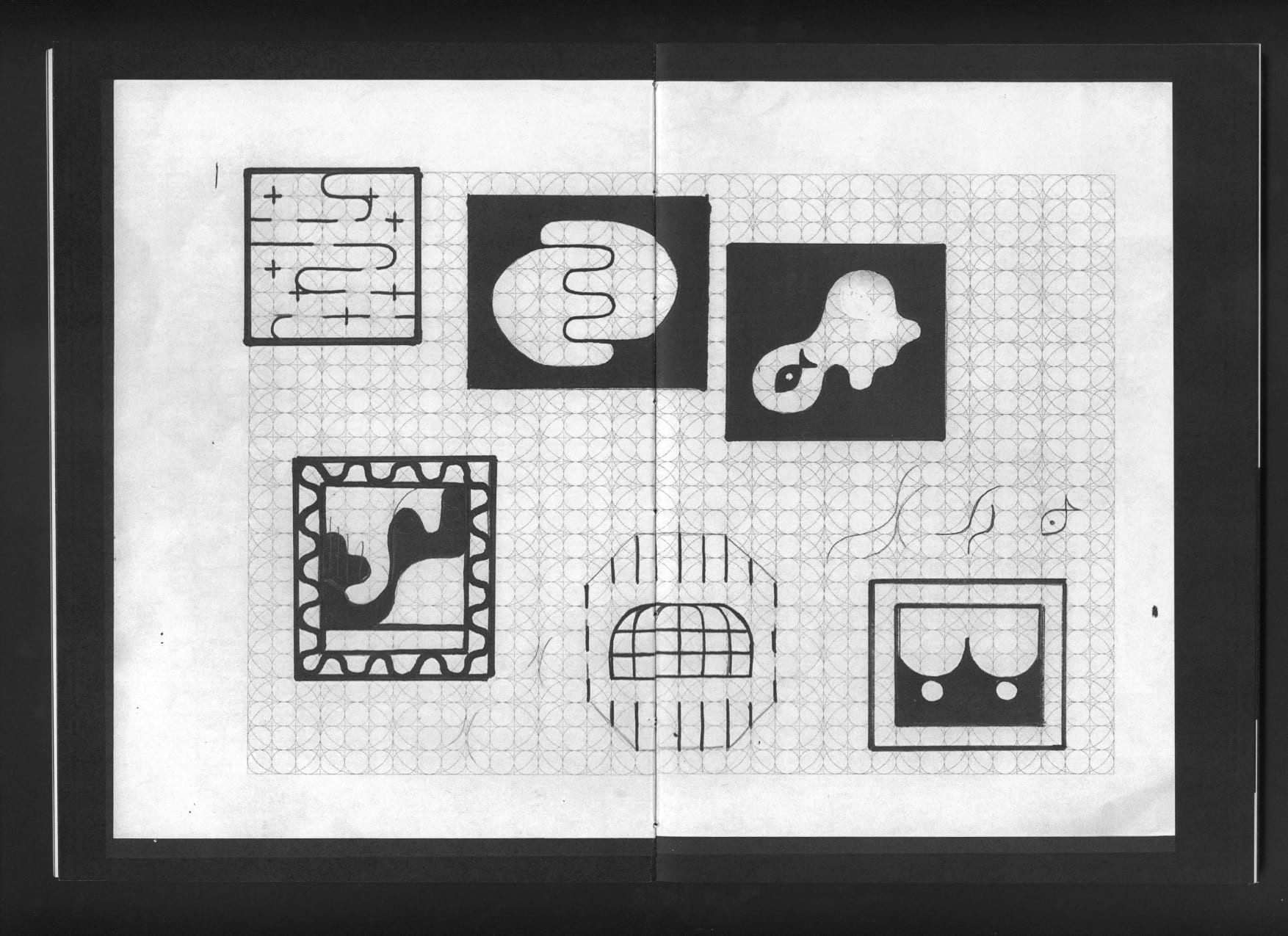
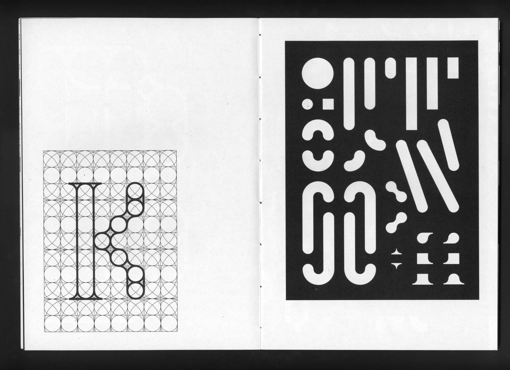
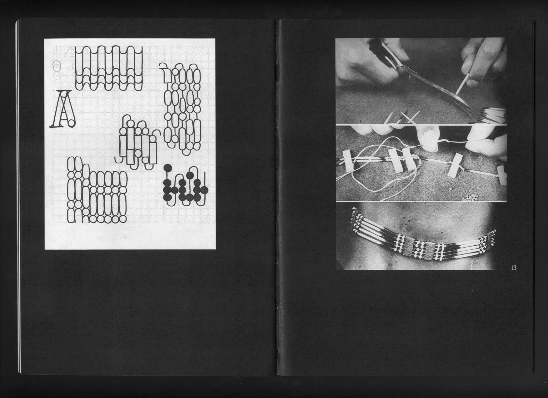
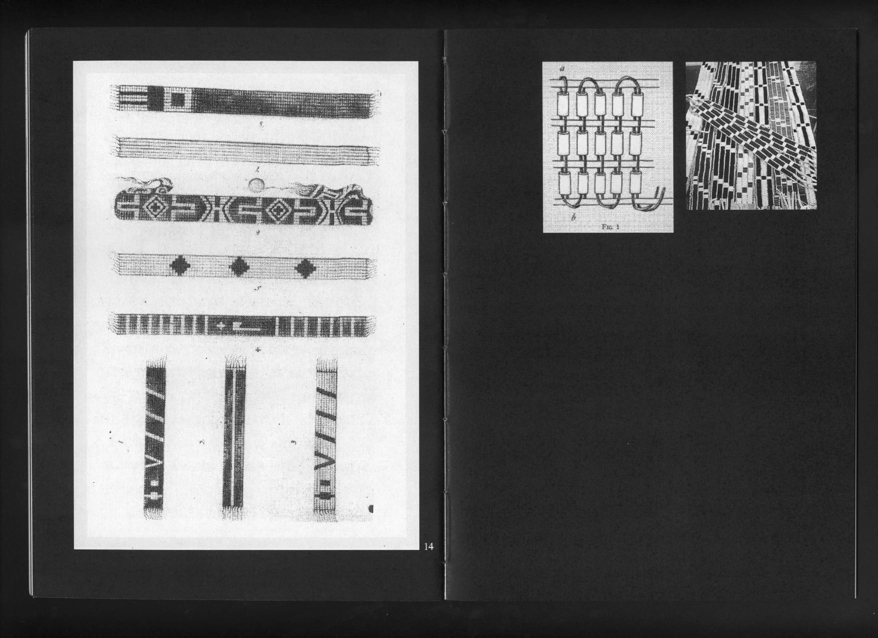
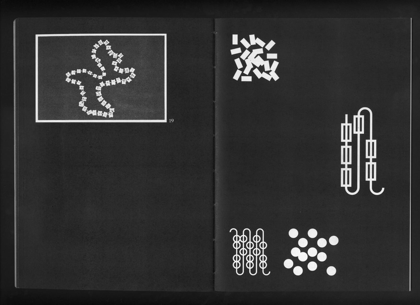
The grid, made up of circles, serves as the basis for the creation of the different typographic forms.
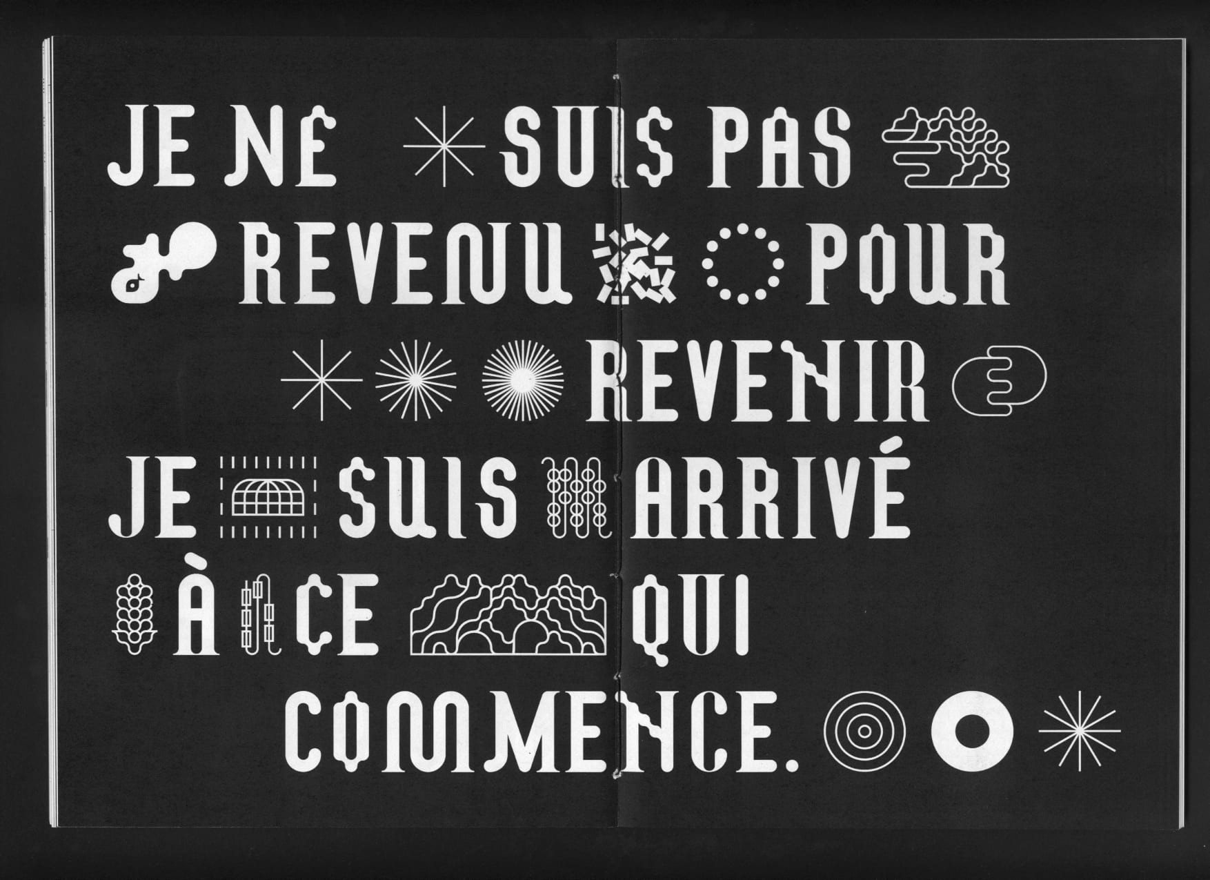
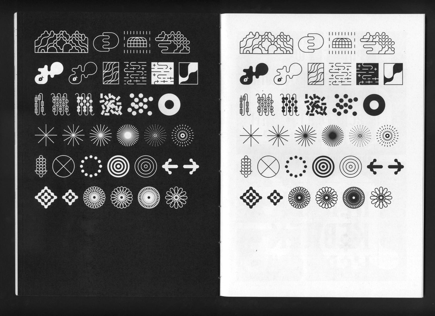
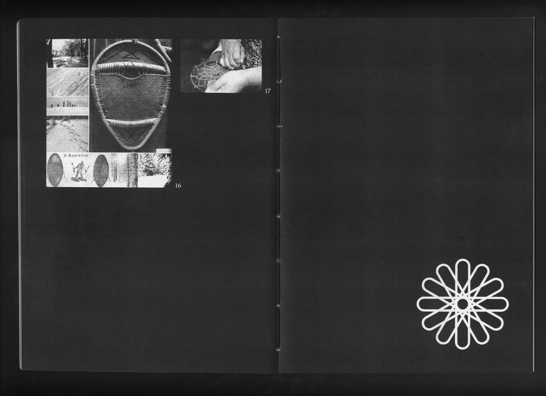
Aboriginal cultures have an oral tradition, hence the importance of images. So the creation of a whole series of glyphs, representing the vision of the circle, the territory and the crafts, allows text and image to be placed on an equal footing.
Resilience: the ability of a body, organism, organisation or system to regain its initial properties after being altered.